
Tower of Zazel
Dev diary #3 - Coloring and perspective
The challenges of coloring by tiles
This time, I wanted to share some more of my experiences when working with a traditional perspective workflow in GB Studio. I wrote a fair bit already during the last dev diary about perspective. That one focused more on how to create the illusion that twelve different scenes were one room in the player's mind. Now it follows naturally to write about how the coloring process works in this project.
Things like tile limitations and the camera's imaginary "position" in the room were the focus at the early stages of the project. I didn't put much effort into how the scene's background graphics would look in color then. I only wanted the background to look good in black and white to see if the game would look good. The project was always intended and has always been developed for a Game Boy Color, and the graphics would need to be colored sooner or later.
How the Game Boy Color displays colored images
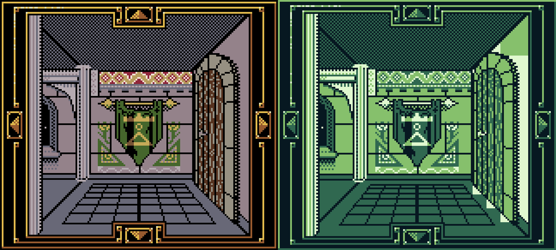
It's a lie. Well, that is not true. However, an image for Game Boy Color does not work like normal graphics and sprites as we think of them in usual game development. The Game Boy and Game Boy Color modes in GB Studio both read background images for 4 particular monochromatic shades of green. In the figure below, there is an example of the green-shaded image that the game engine reads and then divides into individual tiles. The game engine also interprets the 4 shades as one group of colors, or palette, as it's called in the software. So simply, the Game Boy Color does not display a ready-made image in color; it has to color them after the artist has done their work.
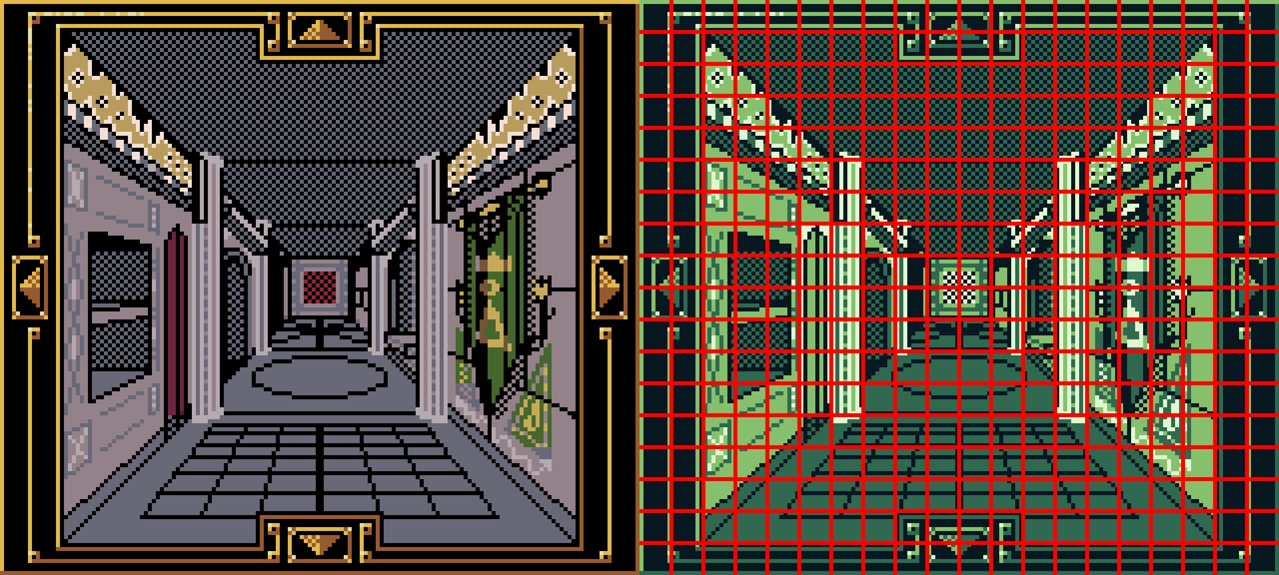
To the left: A screenshot of the background image that the player and developer see in the game. To the right: The game engine's interpretation with a red grid as a visual aid. The game engine divides the image into 8x8 pixel tiles and can only read 4 specific colors.
Applying the color
So far, we have the following:
- One monochromatic background image.
- Tiles of 8x8 pixels made from the image.
- A palette made from 4 different shades of green
How do we transform a monochrome Game Boy into a multicolor Game Boy Color scene? We use those 4 shades in the palette. The game engine, in color modes, sees the palette as a list of colors, and those values can be changed into any other premade palette. The engine can handle 8 palettes at one time in a scene, with the 8th being meant for any user interface. Then you simply tell which tile on the background should have a certain palette.
Another trick you can utilize if you feel that the background tiles and number of palettes are hindering you, like the example image below, then you draw a background element as an actor.
To the left: A scene with its background art colored with the maximum number of palettes allowed. To the right: Same scene, but with an added actor with the shape of a background element and its palette to make the scene more colorful.
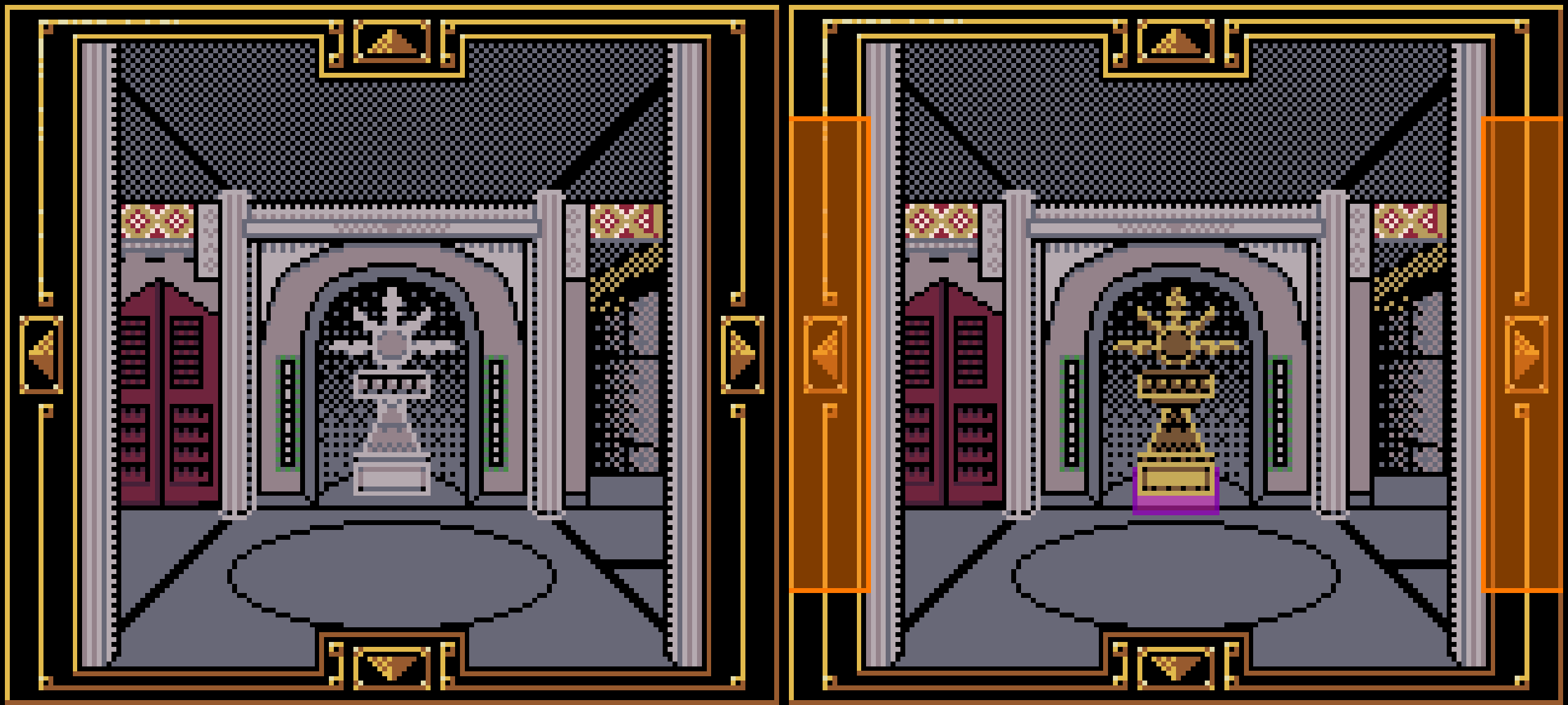
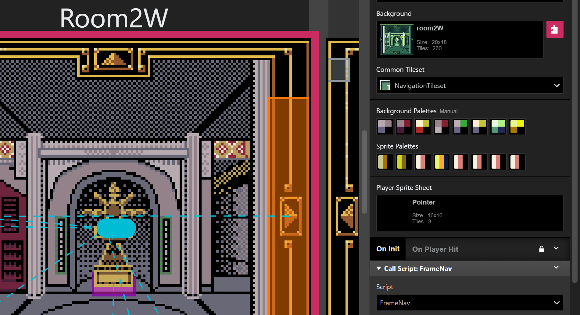
A scene uses 8 separate palettes for sprites. Although these palettes only have 3 colors, one is needed for transparency. In the example below, a special piece of furniture needed to stand out more since it is game-critical. But I still wanted the alcove the retain the wall color. Be careful, though, because this method uses up the number of actors allowed in a scene and how many of sprite tiles that can be rendered on a horizontal line at one time.
This scene uses both background palettes and sprite palettes to color the environment that the player is within.
Using color in a perspective
The rooms in the game use one-point perspective, where objects appear larger the closer they are and shrink toward the back of the room, creating a diagonal distortion. This isn't a common perspective on the Game Boy, or in most games from that era. Sometimes, this approach causes details to extend across multiple tiles and forces them to share a limited color palette. Normally, background elements would be kept square or rectangular to avoid overlaps like this. That wasn't always possible here, though I tried to mitigate it as much as I could.
In the example below, you can see this issue on the door. Both the door and the wall want to use the same palette slot for the lighter green, but they need to appear as different colors. I solved this by creating a custom palette for the tiles where the door and wall meet—in that version, the wall uses the white slot instead.
To the left: The colored background using background palettes. To the right: The monochromatic background image with its tiles colored to match certain color palettes in the game engine.
This limitation also led me to be conservative on how many colors I should use in the scene and inadvertently gave the corridor a spooky, darker tone. Happy accident, perhaps? I could change it in the future, but that would also mean a lot of pallets having to change, because of all the special case palettes in the game.
Conclusion
Making a game where the player moves through what’s supposed to feel like a “room” in first person sure throws unexpected design obstacles your way. I hope I’ve been able to share some of the graphical design challenges I’ve worked through over the past few months. To wrap up this technical discussion, here are a few tips that might help if you want to make a game like this:
- Plan your color palettes early because changing them later with all special case palettes is tedious
- Experiment with custom palettes for tricky overlaps
- Be mindful of tile boundaries and don't make it unnecessarily difficult for you
- Adding background parts as actors can add more color variety, but watch out for actor limits
- Experiment with custom palettes for tricky overlaps
Thanks for reading this dev log, and as always, I really appreciate everyone who is taking their time to engage with my content.
Alex
Comments
Log in with itch.io to leave a comment.
From a certain point of view...
Cool to see the technical aspect of the development, especially when the engine forces one to think differently.
Sometimes limitations can even bring forth good things!
Thanks for the feedback! I agree, it is one of the most fun parts when working on this project. Necessity is the mother of invention after all :)